
Mapping Those Most At Risk
When planning for climate disaster, many federal agencies assess risk on the scale of cities and counties. But in reality, neighborhoods within a city are impacted very differently from one another. A flood that hits Bayview-Hunters Point in San Francisco would pummel a dense, 96% minority community with a poverty rate nearly three times as high as the county average. That same flood in the Marina District would encounter a spread-out, predominantly white, and highly educated population with an average salary nearly ten times greater than Bayview-Hunters Point’s — making the area far more able to withstand the flood and bounce back.
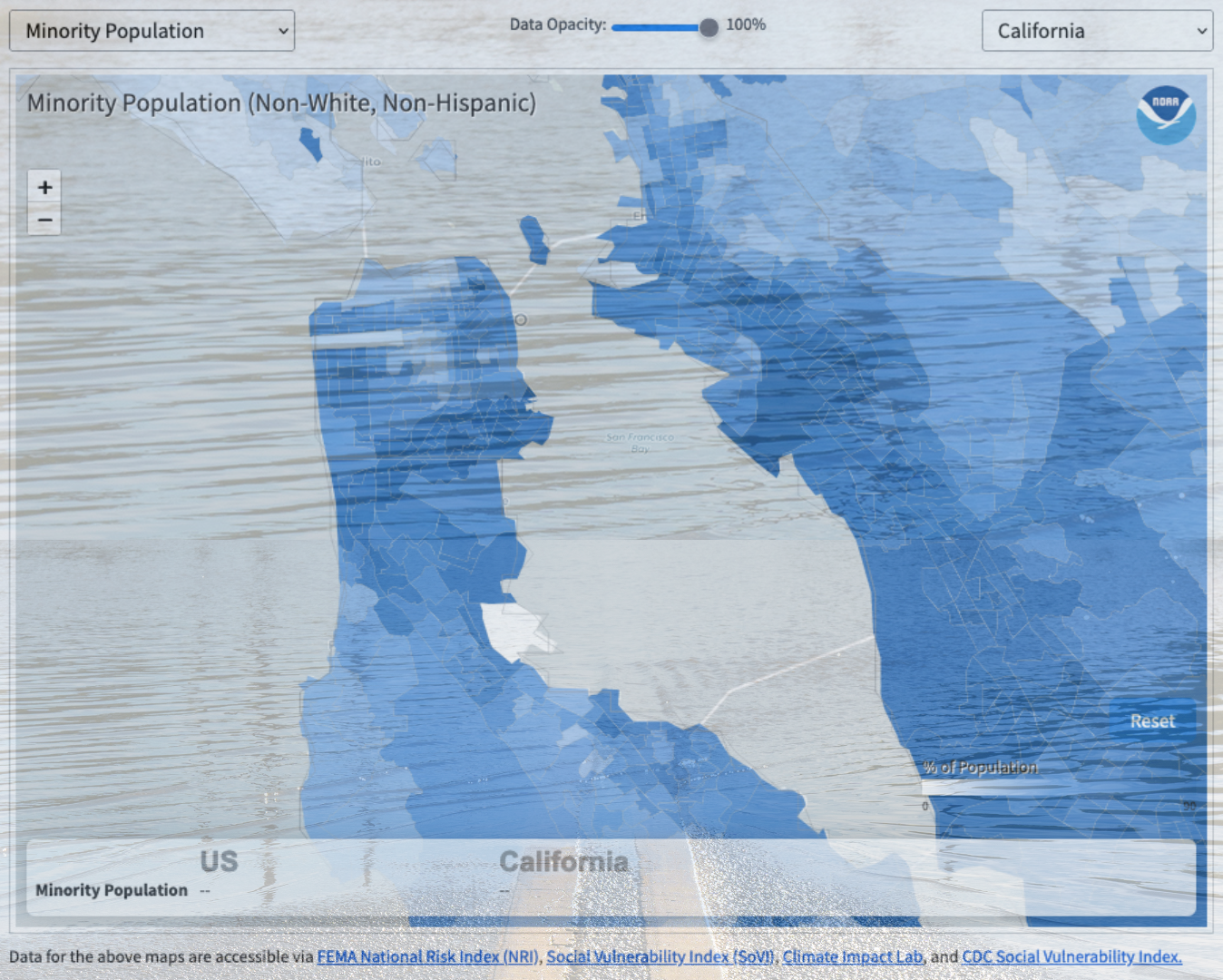
With the National Oceanic and Atmospheric Administration’s recent update to their long-running Billion Dollar Disaster Map, urban planners and citizens can see for themselves how disaster risk and vulnerability vary at the much finer “census tract” scale, representing about 4,000 people in a geographic area. Using the tool to look at “hazard risk” and “social vulnerability,” one can see how frontline communities like San Jose’s Alviso, Marin City, the San Rafael Canal District, East Oakland, and others stand out in stark contrast to the wealthier, whiter neighborhoods around them. The tool shows which census tracts have a significant number of people with characteristics that contribute to social vulnerability — for instance, those without vehicles, senior citizens, or the mobility-challenged. Or race, income, and educational level, which correlate with lower access to essential government programs and services that are essential to helping people and communities rebuild after a disaster.

As risk maps go — and there are an overwhelming number out there — NOAA’s is still a little clunky. The census tract view is hidden in a drop-down menu above and to the right of the map, and to look at historic flood hazard risk one has to manually de-select all six other hazard types. The Bay Conservation and Development Commission’s regional Community Vulnerability map is even more granular, analyzing vulnerability at the small “census block” scale (geographic areas of 3,000 people or less), and it also indicates contamination exposure. But hopefully NOAA’s update represents progress toward seeing pre-existing risk and vulnerability disparities within a city or county, and taking ameliorative steps before the next disaster exposes and widens them.
Other Recent Posts
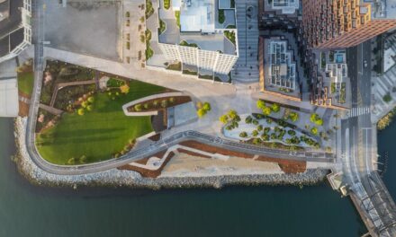
New Shoreline Projects Could Add 168 Acres of Parks to the East Bay
New plans could transform Golden Gate Fields and an Oakland industrial lot into public parks, with sea-level rise resilience built in.
Is Rising Heat Making It Harder for West Oakland to Breathe?
West Oakland has asthma rates 7x higher than the rest of California. As heat waves get more frequent, residents like longtime activist Ms. Margaret Gordon are sounding the alarm.
Flores, Flautas, and an Invitation Outside
The Bay Area chapter of Latino Outdoors offers an invitation to outdoor adventure with free, bilingual hikes and camping trips.
Eco-Anxiety Got You Down? There’s a Group for That
Good Grief Network offers 10-week peer support groups where sharing feelings of climate distress and grief fights despair.
Flores, flautas y una invitación al afuera
El grupo de Latino Outdoors en el Área de la Bahía ofrece una invitación a aventuras externas, con caminatas bilingües y viajes de campamento gratuitas.
Nuevos proyectos costeros podrían añadir 168 acres de parques a la Bahía Este
Nuevos planes podrían transformar Golden Gate Fields y un terreno industrial de Oakland en parques que incorporarán medidas de resiliencia ante la prevista subida del nivel del mar.
El cambio climático hace que respirar en West Oakland sea cada vez más difícil
West Oakland tiene tasas de asma siete veces más altas que el resto de California. A medida que las olas de calor se intensifican, residentes como la activista Ms Margaret Gordon están prendiendo las alarmas.
¿La ecoansiedad te tiene desanimado? Hay un grupo para eso
Good Grief Network reúne a personas para, durante diez semanas, hablar de sus sentimientos de angustia y duelo, y así combatir la desesperanza climática.
Change Detection Made Easier with New Lidar Survey
A new high-resolution lidar dataset gives planners a powerful tool to track flooding, levees, and wetland changes across the estuary.
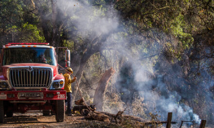
Is Placing Sediment in the Shallows to Feed Marshes Working?
After two years of monitoring, a project to place sediment in shallow water off Eden Landing appears to be boosting surrounding marshes.

